My crush on Tom

180214 My crush on Tom 1

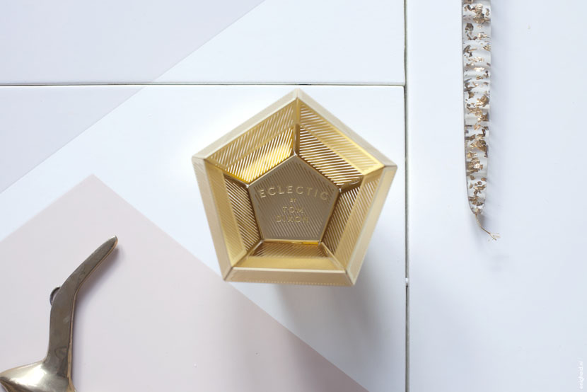
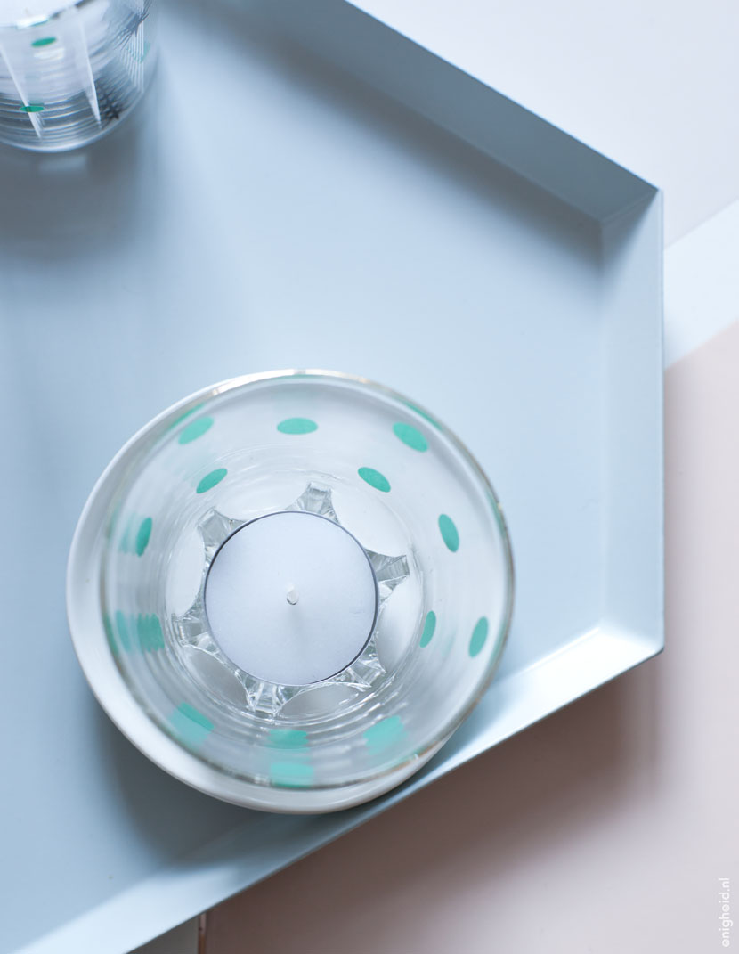
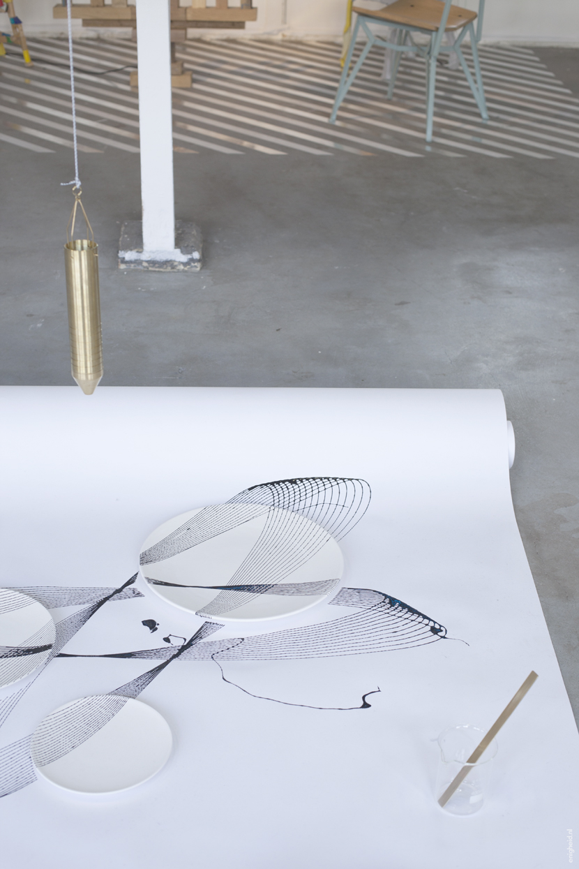
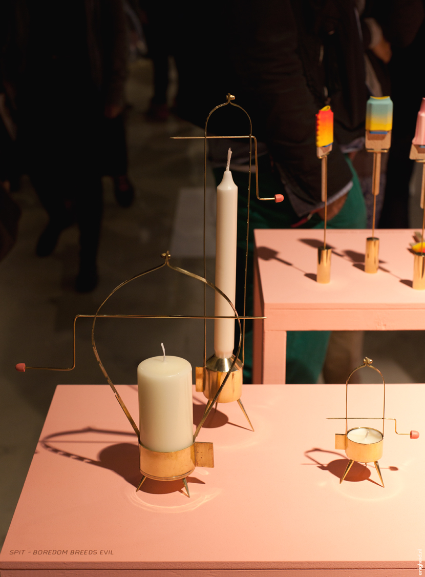
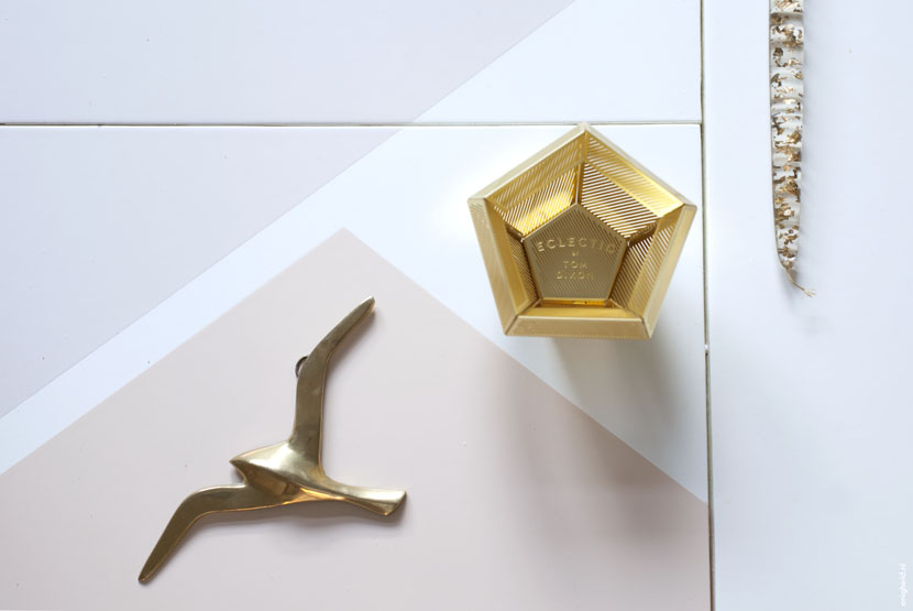
I am in love with Tom. I love practically every Tom Dixon design. I bought one of his copper lamps ages ago and can’t wait to give it a nice place in my living room. When I saw this candle holder from the etch collection, I fell in love once more, but thought it was way too expensive. I waited too long and it almost got sold out. But thanks to some leftover birthday money, I ordered it. Why is it so hard to give yourself a present once in a while?

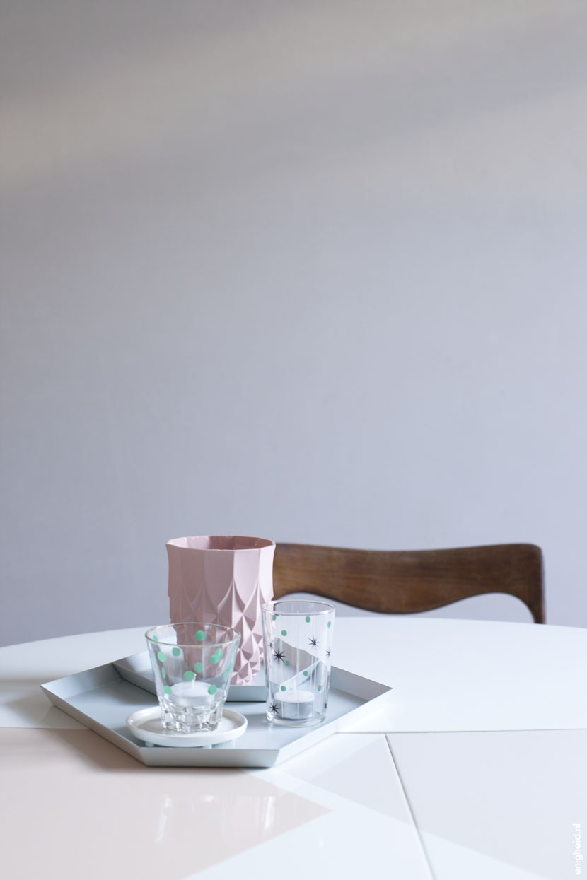
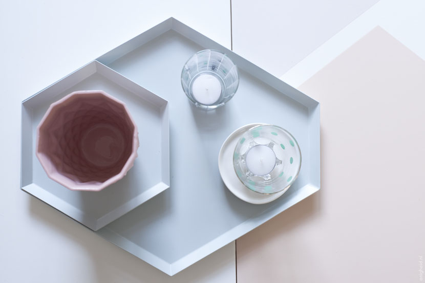
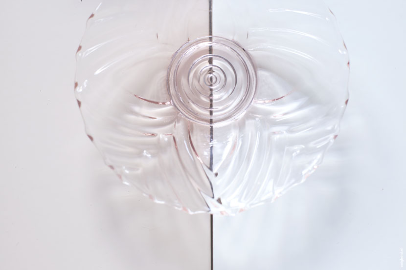
The candle (that isn’t a candle), the bird and bowl, I bought at a fleamarket trip, last sunday. I like my gold.

180214 my crush on Tom 2 2

180214 my crush on Tom 3

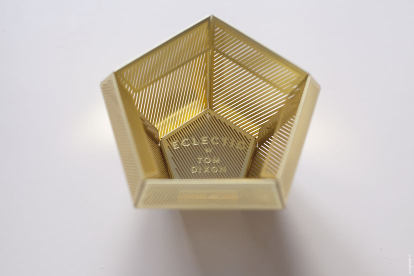
Ik ben verliefd op Tom. Ik hou van praktisch al het design dat uit de stal van Tom Dixon komt. Eeuwen geleden, voor de kopertrend, kocht ik een van zijn koperen lampen en ik kan niet wachten om hem een plekje te geven in mijn woonkamer. Toen ik deze waxinelichthouder uit de etch collectie zag, viel ik weer in katzwijm, maar ik vond hem veel te duur. Ik wachtte te lang waardoor hij bijna overal uitverkocht was. Dankzij wat overgebleven verjaardagsgeld kocht ik hem uiteindelijk toch. Waarom is het toch zo moeilijk om jezelf af en toe een cadeautje te geven?

De kaars (die geen kaars is), de vogel en het schaaltje kocht ik afgelopen zondag op een rommelmarkt. I like my gold.

180214 my crush on Tom 4

Last week

190114 week recap 1

190114 week recap 2

A recap of last week, in a few pictures. The living room is far from finished, but we are getting there. I love the dining room table in it’s future place. And I was thrilled to read the interview with Ellen Vesters in the latest issue of 101 Woonideeën.

The Hay Kaleido trays I bought in the sale at Design Lemonade, sometimes you need to spoil yourself. The pink vase is a Lenneke Wispelwey Pineapple Vase and the small white platter is an item from Maarten Baas‘ Haphazard Harmony collection, I bought it at the Noordbrabants Museum-shop.

190114 week recap 3

Een samenvatting van afgelopen week, in een paar foto’s. De woonkamer is nog verre van af, maar we komen wel in de buurt. Ik vind het zo gaaf om de eettafel al op zijn plek te hebben staan. En het was zo gaaf om het interview met Ellen Vesters te lezen in de laatste 101 Woonideeën.

De Hay Kaleido trays kocht ik in de sale bij Design Lemonade, soms moet je jezelf verwennen. De roze vaas is een Lenneke Wispelwey Pineapple Vase en het kleine witte bordje komt uit de Haphazard Harmony collectie van Maarten Baas, ik kocht hem in de museumwinkel van het Noordbrabants Museum.

190114 week recap 6

190114 week recap 4

Countertop

030114 Countertop 3

A few weeks ago I showed you our kitchen. I think the design of the cabinets is so pretty, but the countertop is really a showstopper. I love the color we choose, it seems a bit transparent and that is why the color seems to change when the light differs.

The countertop is made by Martijn Gerrits. He used Corian to recreate the shape of the original countertop. I think it turned out really well. As you can also see on my Instagram-feed, I can’t stop taking pictures of it.

030114 Countertop 2

Een paar weken geleden liet ik jullie onze keuken zien. Ik vind het design van de kastjes prachtig, maar het keukenblad is echt het sluitstuk van het ontwerp. Ik ben zo blij met de kleur due we gekozen hebben, het is een klein beetje transparent en ik denk dat dat de reden is dat de kleur lijkt te veranderen met een verschillende lichtinval.

Het blad is gemaakt door Martijn Gerrits. Hij gebruikte Corian om de vorm van het originele blad na te maken. Ik vind dat het prachtig is uitgepakt. Zoals je ook kunt zien aan mijn Instagram-feed, blijf ik het fotograferen.

030114 Countertop 1

The Kitchen!

271113 kitchen 1

271113 keuken 2

Finally, FINALLY, our American Kitchen is complete! I am so happy with the result. We (or to be frank T.) used the design from the 50s by Raymond Loewy and made it modern and to our taste. We had a lot of setbacks, but in the end, all the struggles were worth it.

271113 keuken 3

271113 keuken 4

271113 keuken 5

Eindelijk, EINDELIJK is onze American Kitchen-keuken compleet! Ik ben zo blij met het resultaat. We (of eigenlijk T.) gebruikten het design van Raymond Loewy uit de jaren ’50 en pasten het aan naar deze tijd en onze smaak. We hadden heel wat tegenslagen, maar uiteindelijk was al het gedoe het waard.

271113 keuken 6

271113 keuken 7

DDW III

021113 DDW III 1

I still had some DDW-pictures I wanted to share. These were all shot at the TAC-building. Picture no. 1 the installation Oscillation Bowls by David Derksen. The third and fourth picture shows parts of the My Sweet Design Fair by Hello Randomness.

021113 DDW III 2

Ik had nog wat DDW-foto’s die ik hier wilde delen. Deze foto’s nam ik allemaal in het TAC-gebouw. Foto 1 is van de installatie Oscillation Bowls van David Derksen. De derde en vierde foto zijn van My Sweet Design Fair door Hello Randomness.

021113 DDW III 3

DDW II

241013 DDW KG 1

The Klokgebouw is one of the DDW prime locations. It was really crowded and the light made it hard to take nice pictures, but I’ve managed to take a few. Apparently this year’s theme was ‘mirror-selfies’.

One of the booths I was fascinated about, was the one of Lenneke Wispelwey and Ido Garini of Studio Appétit. Look at the great combination of her ceramics with the food. This presentation of the pieces of food is a bit unusual but also so refreshing, I loved the use of the spikes and the dimension it gives to the table setting. Lenneke is so talented that I was almost to impressed to talk to her.

Brekel and Strekel made me laugh out loud. The spit is called ‘Boredom breeds evil’. I want one of those. I also really liked these mirrors, designed by Daan de Haan and Jannie Schmitz, made by company Océ. I think it is so cool they decided to search for designers to show the possibilities of high resolution 3d printing. Cool result, right?

241013 DDW KG 3

241013 DDW KG 4

Het Klokgebouw is een van de hoofdlocaties van DDW. Het was er druk en het licht maakte het lastig fotograferen, maar ik heb toch een paar plaatjes geschoten. Blijkbaar was mijn thema dit jaar ‘mirror-selfies’.

Een van de stands die ik fascinerend vond, was die van Lenneke Wispelwey en Ido Garini van Studio Appétit. Zie die geweldige combinatie van haar keramiek met deze etenswaren. De presentatie van ger eten was ongewoon maar ook zo verrassend, ik vond het gebruik van de pieken geweldig, het geeft de tafel setting zo’n dimensie. Lenneke is zo getalenteerd dat ik bijna teveel onder de indruk was om haar aan te spreken.

Brekel en Strekel lieten me hardop lachen. Het spit heet ‘Boredom breeds evil’. Die wil ik een. Ik was ook fan van onderstaande spiegels, ontworpen door Daan de Haan en Jannie Schmitz, geproduceerd door het bedrijf Océ. Ik vind het zo gaaf dat zij besloten in zee te gaan met designers om de mogelijkheden met high resolution 3d printing te laten zien. Gaaf resultaat hè?

241013 DDW KG 2

DDW I

231013 DDW LP 1

My T. and I went to the Dutch Design Week in Eindhoven saturday. We saw amazing design, art and were a bit overwhelmed by the amount of inspiration (again, we have the same experience every year we visit DDW). We took our bike with us, so we were able to visit both Strijp and some locations in the city centre. That was so convenient.

I’ll dedicate some more blogposts this week to all the cool, smart and fun things we saw. Today I want to show you some work by Lex Pott. His work was shown at different locations (I remember that I saw his work last year at DDW too) and I had to stop, stare and shoot every time I saw a piece. I love his Transience-mirrors. And what do you think about the True Colours shelves and objects? SO inspiring.

In the city centre, Vlisco had an exhibition. I think in Holland we all know their fabrics (I have some on my textile pile) but they showed them in such a modern, cool and unexpected way, with a touch of the historical context too. Gorgeous. And the fabric design by Studio Job was sublime.

231013 DDW LP 2

231013 DDW LP 3

Mijn T en ik bezochten de Dutch Design Week in Eindhoven afgelopen zaterdag. We zagen fantastisch design, kunst en waren overdonderd door de hoeveelheid inspiratie (alweer, eigenlijk hebben we dat elke keer als we bij DDW zijn). We namen dit keer onze fietsen mee, zodat we zowel op Strijp als in het centrum locaties konden bezoeken. Zo fijn.

Ik zal deze week meer blogposts laten zien van alle gave, slimme en humoristische dingen die we zagen. Vandaag wil ik het werk van Lex Pott laten zien. Zijn kunstwerken zag ik op verschillende locaties (ik herinner me dat ik zijn werk vorig jaar op DDW ook al zag) en elke keer als ik wat van hem zag moest ik stoppen, kijken en een foto schieten. Ik hou van zijn Transience-spiegels. En wat denk je van de True Colours shelves en objecten? ZO inspirerend.

In het stadscentrum gingen we naar de tentoonstelling van Vlisco. Ik denk dat iedereen in Nederland hun stoffen kent (ik heb een aantal lappen op mijn textielstapel liggen) maar ze lieten ze op zo’n moderne, gave en onverwachte manier zien, met ook een blik op de historische context. Geweldig. En de nieuwe stof van Studio Job was subliem.

231013 vlisco 1

231013 vlisco 2

Woonbeurs II

And here is some more Woonbeurs-prettieness. Lamps Light Breeze by Alex de Witte, (from my hometown ‘s-Hertogenbosch!) and a textile installation by Lenneke Langenhuijsen and Brecht Duijf at the Textiellab-booth. The mute colourpallette, the softness of the wool and the hard lines combined were really impressive. As were the StoryTiles by Marga van Oers. Such a beautiful concept, old tiles with pretty pictures and a few bold colours. Another thing I immediately fell in love with was the Bead Mirror by Vroonland & Vaandrager. I really, really would love one hanging on my wall… The paper ball with the beautiful colours is from Like Stationery and the green Hang it all is by Vitra, of course.

If you would like to pay a visit yourself, the Woonbeurs is open untill next sunday, the 6th of October.

Ook vandaag nog wat Woonbeurs-moois. Lampen Light Breeze van Alex de Witte (uit mijn hometown ‘s-Hertogenbosch!) en een textiel-installatie van Lenneke Langenhuijsen van Brecht Duijf in de Textiellab-stand. Het zachte kleurenpalet, het aaibare van de wol gecombineerd met harde lijnen vond ik indrukwekkend. Net als de StoryTiles van Marga van Oers. Een mooi concept, oude tegels, mooie afbeeldingen met een paar pittige kleuren. Iets anders waar ik meteen verliefd op werd was de Bead Mirror van Vroonland & Vaandrager. Wat zou die mooi hangen in mijn huis… De papieren bal met de prachtige kleuren is van Like Stationery en de groene Hang it all is, natuurlijk, van Vitra.

Mocht je de Woonbeurs ook nog willen bezoeken, hij is geopend tot en met zondag 6 oktober.

Woonbeurs I

Today I was invited to blog from the Woonbeurs. I had a blast: I loved seeing all the interior design and meeting a lot of fun bloggers.

One of the most inspiring things at the Woonbeurs, are always the booths of the Dutch home and decor magazines. The pictures on top are from the house designed by 101 Woonideëen, it was fun and fresh. I always love their use of colour. The pictures in the middle are of the Eigen Huis & Interieur-house. They showed a lot of cacti (I don’t get tired of them), marble and pretty design items. The last pictures are taken in the VT Wonen-barn. The roof garden was amazing and they had a few artists showing their craft: this really gave their booth an extra dimension. All the houses were so unique and definitely worth a visit.

Vandaag was ik uitgenodigd om te bloggen vanaf de Woonbeurs. Ik had een geweldige dag: ik werd overspoeld door prachtig interieur-design en het was enorm gezellig om allerlei leuke bloggers te ontmoeten.

Een van de meest inspirerende dingen op de Woonbeurs zijn altijd de huizen ingericht door de woonbladen. De eerste foto’s zijn van het 101 Woonideëen– huis. Leuk en fris ingericht. Ik word altijd erg blij van hun kleurgebruik. De middelste foto’s zijn van het Eigen Huis & Interieur-huis. Daar zag je veel cactussen (die raak ik niet beu), marmer en mooie design items. De laatste foto’s zijn genomen in de VT Wonen-barn. De daktuin was gaaf en beneden lieten zij een aantal kunstenaars aan het werk die hun ambacht uitoefenenden: dat gaf een extra dimensie. Alle huizen waren zo uniek: de moeite van het bezoeken waard.

Souvenirs

What I love most about going on a holiday, is going to foreign thrift stores and interior design shops. So inspiring, especially in Scandinavia. I found the watering can and pink glass bowl thrifting in Sweden and I bought the plate and tray at Lagerhaus.

Talking about inspiration: I stumbled upon a few great video’s at Inspiration Point with Jonathan Adler a couple of days ago. I am a big fan of Jonathan Adler’s work, it’s so good, fun and clever. Be sure to check these video’s out, I think they’re phenomenal. Enjoy!

Waar ik het meest van houd op vakantie, is om naar buitenlandse kringlopen en interieurwinkels te gaan. Zo inspirerend, vooral in Scandinavië. Ik vond de gieter en het roze schaaltje in een Zweedse kringloop en kocht het bordje en het dienblad bij Lagerhaus.

Over inspiratie gesproken: een paar dagen geleden kwam ik geweldige filmpjes tegen op Inspiration Point with Jonathan Adler. Ik ben groot fan van zijn werk, het is zo mooi, grappig en slim. De video’s zijn echt de moeite waard, geniet ervan!